


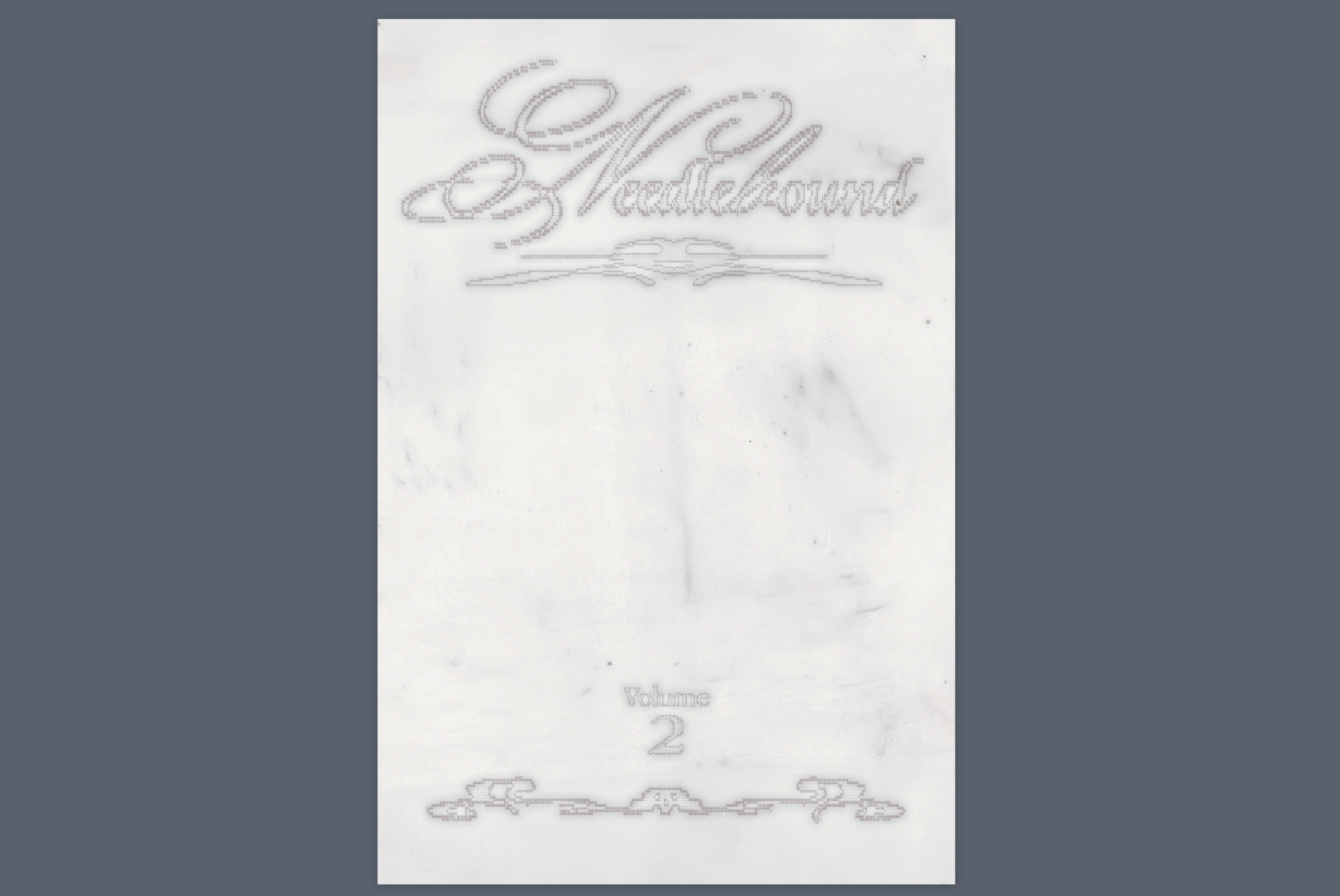
Needlebound: A Loosely Woven Retrospective
Textiles are slow. Publishing is slower. A look back at what was gathered, tangled, and eventually bound.

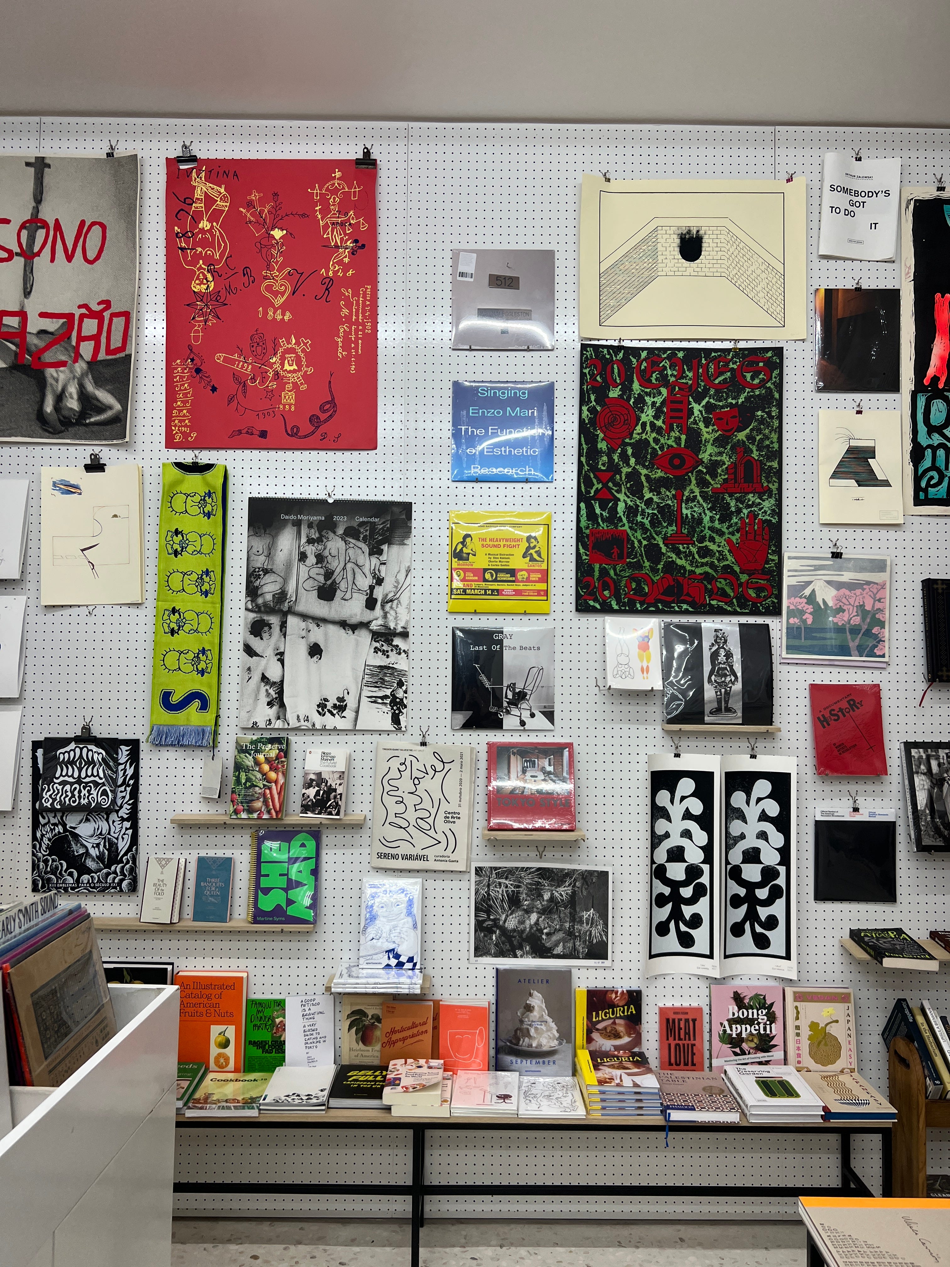
I’ve been drawn to small press since Rookiemag introduced ‘zines’ to me in high school. Small press taught me that publishing could feel like passing notes or fulfilling the fantasy of leaving your diary somewhere on purpose and hoping the right person finds it. When I travel to a new city, I take it as a personal challenge to seek these publications out. They rarely present themselves easily and that’s part of the point. I build my itinerary around bookshops that require a small pilgrimage: second-floor walk-ups in a warehouse studio space, converted garages, backrooms behind cafés with no signage except for a barely-legible sticker on the door where you have to ask someone to buzz you in. Ones where you can find books about Japanese playground equipment or the socioeconomic history of strawberries.
Even in these spaces that feel like a refuge for publishing at the margins I rarely saw projects that reflected the kinds of conversations I was having in my own life about knitting and fibre arts. I kept looking. But most of what I found landed at the extremes: academic publishing that felt hermetically sealed, signalling rigour through dense language I no longer had the energy (or institutional obligation) to decode. On the other side, DIY craft magazines tried too hard to be accessible and ended up sanding down the edges of the work, simplifying it into easy-to-digest lifestyle content.
Meanwhile, the writing I kept coming back to didn’t exist in print. It was voice notes from internet crochet friends airing out woes about their work getting ripped off by AliExpress, TikTok comments arguing over natural vs. synthetic fibres, Close Friends stories about the anxiety of their work looking to similar to another fibre artist they follow, 2006 forum posts about choosing knitting over finishing your thesis. Fragments full of texture that felt nuanced, sensitive, and precise.

There was a gap between the observations about fibre and process and the formats available to hold it, so I decided to make it myself.
In January 2024, I put out a call for submissions on my personal knitting Instagram account for a loosely defined fibre arts publication project. I was looking for essays, images, and reflections on the feeling of making something by hand and sharing it on a platform that rarely rewards that kind of time.
On the Name Needlebound
A common thread in the fibre arts community is the shared appreciation for creating something tangible—a piece that can be held and felt in contrast to our screen-dominant lives. I wanted the publication to reflect that, too: something durable, something printed.
That’s where the name Needlebound came from. It’s an homage to the 5th-century craft of Nålebinding, a precursor to knitting. The technique itself is slow and deliberate, made from looping threads with a single needle. But it also carried a social function: artisans would gather to work, to share stories, to foster community. It was a craft as much about connection as about the finished product.
That spirit continues today, albeit in new forms. Online, fibre artists have carved out their own spaces—YouTube’s “knit and chat” videos, livestreamed tutorials, Instagram captions that function as short soliloquies. These parasocial exchanges blur the line between solitude and connection. As Sherry Turkle writes in Alone Together, “our networked life allows us to hide from each other, even as we are tethered to each other.” Her language—"ties," "tethers"—borrows from the language of fiber itself.
For me, Needlebound is an attempt to hold both truths at once: the communal and the solitary, the digital and the tactile, the fast churn of online platforms and the slow, intentional work of craft. By bringing these stories into the physical format of print, I hope to create a space that feels more enduring than something easily scrolled past.
On Print Influences
I started with a list of things I didn’t want the publication to be. I didn’t want slickness or excessive polish. I didn’t want a magazine that used design to signal seriousness or trend-awareness. The visual tropes of “authenticity” in a quick Google search of fibre arts books (warm neutrals, earnest serif fonts, a texture that reads as handmade) felt like style without substance.
What I did have were a few reference points I kept circling back to:


Are.na Annual was one of the first books brought I encountered that made an online place feel like something I could hold. It felt like a deliberate act of disconnection. A way of taking something ephemeral and digital and bringing it into print.
DOOF’s Instagram takeover and print publication that followed stayed with me too. It felt like a potluck where everyone brought their most personal dish. The tone was casual, but the work and contributor narratives carried weight.
Mold Magazine manages to draw together wildly disparate references while still feeling cohesive. The curation is sharp, but never showy. It reminded me that clarity doesn’t have to mean uniformity, and that a publication can feel rigorous without losing its texture.
On the Cover Design
The cover was designed by Juliette Dupont Duchesne. I’ve admired Juliette’s work for a long time. She has this uncanny ability to create an atmosphere that feels both intangible and deeply familiar, like something you’ve seen before but can’t quite place. Her work always manages to hold a sense of mood without overexplaining itself, which is exactly what I wanted for the cover of Volume 2.
What visual references helped shape the cover?
Juliette: A book that regularly inspires me in my projects — and especially for this one — is The Grammar of Ornament. I’ve referred to it many times for illustrations, embellishments, and typographic choices. To reconnect with the essence of textiles while anchoring it in a digital approach, I first ran my designs through an ASCII converter before reworking them in Photoshop. The result evokes a cross-stitch effect, sitting at the intersection of digital and craft.
How would you describe the mood of the final cover?
Juliette: What I appreciate most about this design is its monochromatic quality. Not working with a wide colour palette allowed me to explore image treatment more deeply. I actually learned new techniques through this project that I still use regularly today. It was a really fun and rewarding process.


On the Layout Design
The layout for Volume 2 was designed by Tito Rocha—my closest collaborator, partner, and the person I share both a home and a bookshelf with. We’ve always had a soft spot for printed matter. We still think of our first trip to the Toronto Comic Arts Festival in 2018 as the unofficial start of our relationship: wandering through crowded aisles, quietly pointing out the things we wanted each other to see.

What’s one moment from working on the layout that sticks with you?
Tito: It would definitely be the first moments I get to glance at the images for each entry, and how often I’m stunned by the quality of the images and the ethereal, arcane quality many of them contain. I have to resist the urge to let every image take up a whole page, and so finding an appropriate way to conserve space while doing justice to the images has been a great challenge.
How did our workflow (between sitting on couches at home to working in neighborhood bars) shape the feel of the book?
Tito: Our workflow kept the collaborative aspect so present—rarely have I gotten to work so closely and so consistently alongside a collaborator, and this greatly accelerated the turnaround time without feeling rushed. But on a deeper level, I think living and breathing Needlebound together both in and out of the home allowed each of our tastes and preferences in publication design to shine through.
Were there any unexpected layout choices that you felt really made the book?
Tito: With Volume 1, in order to be as economical as possible with the page count, some of the spreads would contain the end of one entry, and the beginning of another, with the start of the entry only being indicated by a header. In this volume, we wanted to push the visual presentation beyond function and efficiency. In the early stages of Volume 2’s design, I found the entry titles evolving beyond simply a decorative header, and instead taking on a much more bespoke approach, featuring an image contained in the entry (sometimes distorted and abstracted by me) alongside the title and contributor name. These “title pages” provide some rhythm and consistency to the book, while also adding some extra visual flare and intrigue as the reader gets a preview of what is to come in the entry.


Can you describe a detail or page you’re particularly proud of—and why?
Tito: In my opinion the first two pages of Du Mouton au Fil by Dominique Bartels showcase the design system of the book well—we see the way that the contextual elements like book and section titles, entry title and contributor name, and page numbers interact with imagery, as well as stand on their own on a sparse page of text. I’m particularly proud of the title pages for Carried Ceremonies and Breathing Weavings / Photosynthetic Jacket, and those absolutely massive ampersands that take up two pages.
Were there any books that inspired your layout treatment?
Tito: Aura Battlers 2 features editorial imagery of Japanese figures and model kits based off the anime of the same name. Through my hobby in Gundam model kits, I discovered a variety of beautiful editorial publications that collect the designs of Japanese model products. My treatment of the titles and other text elements being surrounding by irregular rectangular frames throughout Needlebound were directly inspired by Aura Battlers 2 titles for each figure.
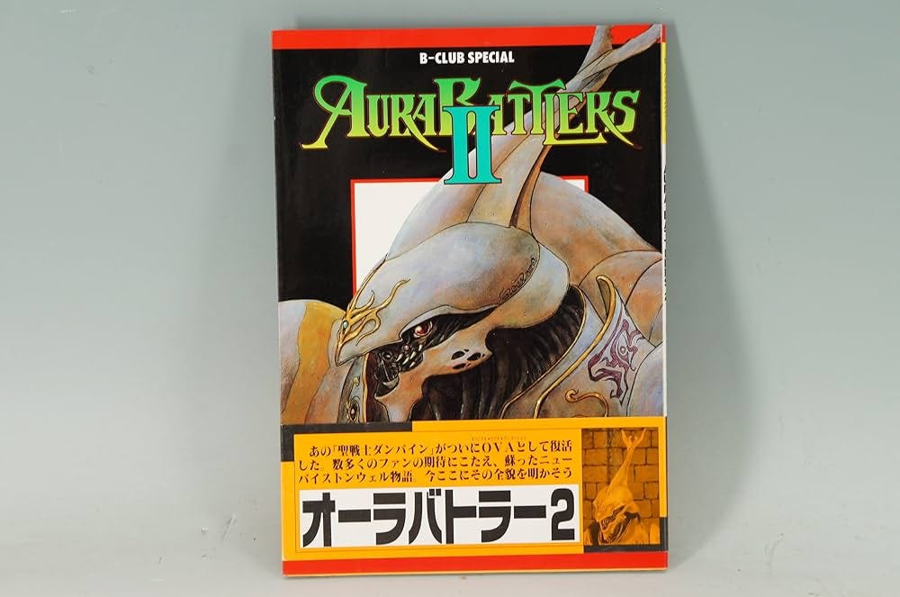


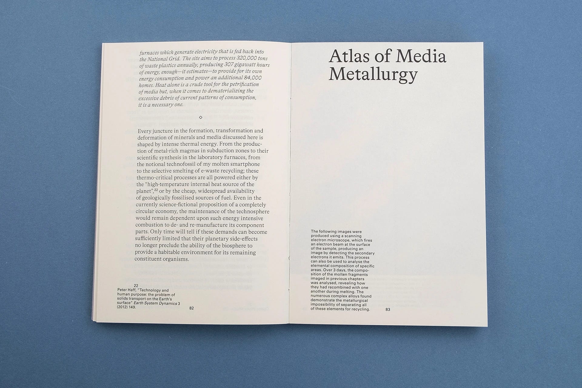
Tito: Petrified Media by Stephen Conford informed the layout of the body text, and the integration of footnotes. This book applies a metallurgical and geological lens to the components of the iPhone which contain scarce metals. Essays are paired with microscopic images that reframe the metals beyond the parts of a machine and into geological landscapes of colour and texture. From a book design standpoint, I look to this publication a lot, but its fusion of artful imagery and writing that applies a fresh and contemporary perspective on ancient materials felt parallel to the goals of Needlebound. Aura Battlers 2 coincidentally also feels related in spirit. These figures are not just machines—they are a hybrid of the organic and the mechanical, the arcane and the technological, just as Needlebound aims to illustrate the boundary of these ancient practices in relation to contemporary technology.
On the Divider Design
The section dividers were designed by Matt Prebeg As a researcher by trade and an artist whose practice often extends directly from his investigative instincts, Matt approached the dividers with a level of observation and precision that suited the in-between spaces of the book.

You pulled from 15th-century embroidery books—what did you find compelling about that source material?
Matt: I generally draw a lot of inspiration from archives. What I found interesting about these books in particular was how anachronistic they felt—like they could have been textiles from any time period, historical or contemporary. I think that timelessness plays well with Needlebound.
How did you approach making something that felt archival and contemporary?
Matt: The inspiration material speaks for itself! The key was finding the right typeface: Folk Art by P22 Type Foundry. This revival typeface was designed by Richard Kegler, primarily based on needlework and folk art styles of German settlers in Pennsylvania.
What did you want a reader to feel when they hit a section break?
Matt: To me, the section breaks should not take away from the content of the publication, but rather give readers breathing room; an invitation to take pause, process what was just read, and keep going. It’s like a meditation.


On Editing
I met Angie Kim online—someone else navigating tech but pulled toward publishing, thoughtful about language and sharp with structure. Izzy Orfi was the first person I met in undergrad, and is still one of my closest friends. She ended up working in copyediting full-time (something that makes perfect sense in hindsight, given her longstanding instinct for clarity and care with language). They each brought steadiness to the process that balanced out my tendency to stay zoomed out. Where I focus on pacing and tone, they paid attention to the line breaks, the commas, the em-dashes, the phrasing that subtly shifts meaning. We treated editing less as fixing and more as tuning and listening close to what each piece wanted to be.

What was your experience like editing these pieces?
Angie: It was a real privilege and a blast to be able to be a part of bringing such incredible pieces to life! Working across so many interesting and thoughtful submissions definitely rejuvenated my love and appreciation for the craft we share.
Izzy: Copyediting was an incredible experience. I approached editing backward to how I would normally engage with art— I looked at the statements before looking at the artwork. I had never really approached art in that order before, and it was exciting because I felt I could approach the work with the artist’s explanation and intentions at the top of my mind.
Were there any patterns you noticed across the submissions—stylistic, thematic, or emotional?
Angie: The word that immediately comes to mind is reaching – despite fibre arts being deeply intimate and personal, there are rich throughlines that span generations and continents that each person grasps at in their work. I think the set of works presented in this volume of Needlebound really embodies that sense of yearning.
Izzy: Many of the artists interrogated tradition and where their current practice sits in a historical context, which was fascinating to learn about. Several also addressed cultural ideas around the association of fibre arts with women's work.
What felt different about editing this compared to more typical writing or editorial work?
Angie: Most of my editorial work in the past has been journalistic or in opinion writing, so it took me a second to get used to editing submissions that were largely personal and centred around an accompanying piece or body of work. Rather than looking at writing from the standpoint of “how do I make this as convincing as possible,“ I had to adjust my approach to look at the whole work and see the space it wants to take up.
In particular for artwork-based submissions made by the original artist, the person who is writing the text is also the one who knows the most about it, so it’s a delicate process to balance trusting the words that are in front of you while also trying to tease out the clearest and truest form of the text.
Izzy: I mostly copyedit medical documents for my work, which involves conveying information from textbooks or journal articles with as much clarity as possible. In that process, we are trying to create content in a very specific, cohesive, and readable style. Copyediting Needlebound was super different (and really fun!), as the information to convey from the artists is so much more personal and subjective. I tried to keep edits to a minimum and ensure that any changes I made stayed consistent with the artist’s own writing and vocabulary style.
On Sticker Sheets
When I was in Porto last year, I came across a book at Materia Prima called Ludic Garden. It came with a sticker sheet—playful, precise, unexpected. It made me think about the kinds of small details that stay with you. It reminded me of the way a perfume sample used to fall out of a magazine: not the main event, but a detail that shaped how you remembered the whole thing. A kind of sensory footnote.


For this volume, I worked with Ryen Steward to create a set of die-cut stickers that carry that same spirit. Ryen designed a custom typeface inspired by embroidery—threaded, looping, slightly irregular. A digital rendering of something hand-touched. The stickers will be printed locally in Montreal and included with the first 100 copies of the book.
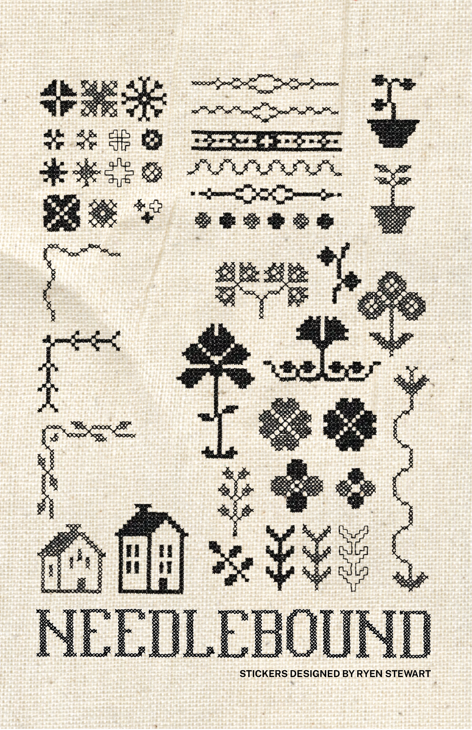
Ryen: RS Monostitch is a type design project, led by the idea of modern world values and machinery, with inspiration from the past. Blending both the style of 1800s cross-stitching samplers with new age of industrial machines and digital editing, the typeface paints a picture of what we can achieve in the modern day. By leveraging automated processes, this project aims to create a font that captures the charm of handcrafted cross-stitch while optimizing efficiency and scalability that wouldn’t have been possible back in the day.
On Getting Ready To Print
I made Needlebound the same way I knit my first sweater—piece by piece, figuring it out as I went. I followed tutorials. I second-guessed myself. I kept working even when I wasn’t sure what it would become. At first it felt like assembling fragments of images, writing, ideas that didn’t yet belong to a structure. But over time, something started to take shape.
The end result isn’t perfect. There are uneven moments. A small typo in Volume 1. Some pacing I’d probably handle differently now. A more efficient way to organize my Google Docs. The imperfections aren’t a feature, exactly, but they reflect the honesty of an object made with time, attention, and a willingness to adjust. A book that shows its working parts reflects the same spirit found in fibre practice, where process is legible in the final form.
Volume 2 is available for pre-orders until June 15 here.